Evaluation

Overall over the past couple of weeks I have enjoyed photography a lot and I feel like I have come quite far from what I originally started out at. I had never had any proper experience with photography and over this semester I have learnt different aspects of photography which I have found not only interesting but self pleasing. I have learnt about aperture, how to frame an image, focusing, structuring and lighting. I think I have improved over the weeks and it has been very enjoyable  but there is still a lot for me to learn and I plan to take my skills and knowledge and expand them further.

Appropriation:

I enjoyed my first brief as I felt like I could go in depth using existing images which already have a meaning but interpret them and alter the ideology. For example my l’oreal appropriation I felt was quite gripping as I took quite a disturbing image of rabbits all locked up being tested on. Which is what many large global make up brands still do to this day which I personally find wrong and i wanted to question that, using the L’oreal slogan, you’re worth it. Is it actually worth it, all this pain and suffering these animals go through. Furthermore I found the image layout is very structurally overwhelming , they are all in a line, facing the camera. I just think it works well and It was my favourite design out of them all.


appropriation animal testing

Still Life (things):

This brief I had fun with as I experimented a lot with lighting, shadowing and editing. I liked the outcome of my triptych, how they all linked and related through the element of fire but also how I photographed them. The dark but indulging mood throughout each image. It kind of relates back to shakespearian times before there was any electricity and it was all medieval. The golden orange glow from the fire and the dark ease throughout the images I really find visually pleasing.

candle


Portraiture:

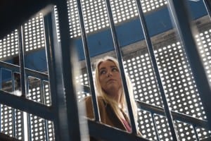
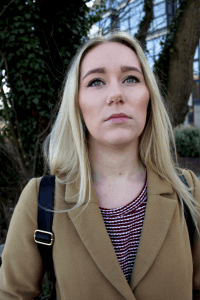
Portraiture was interesting and I did enjoy this brief a lot. Looking at existing photographers such as Steven mcCurry broadened my mind and opened it up to what possibilities and standard of work there is out there. His work especially amazed me, the way he focuses his subjects eyes into the image so it really looks deep into you. He connects the subject and the camera very well, making it engaging and in a way heart moving. You feel like you know the person from just looking at an image of them and this is what I wanted to reflect in my portraits.  I like being able to see ageing within a person and get a rough idea of what there life has been like and what type of person they are just from a still image.
DSC_1752


Screen Shot 2016-04-11 at 02.14.46


Home:

For my last brief I wanted to take all the knowledge and skills I have learnt over the last few briefs and put them into this final one. I decided to take images of things that mean home to me and I want people to feel that feeling when they look at my photographs (Like Steven Mccurry’s work). Even though I didn’t fully accomplish this I know I did personally. For example when I look at the photograph of my dad I see him within that, his kind relaxed and witty personalty. Furthermore the abstract image of the humber bridge I took I think is my strongest photograph and it just shows how I have come so far from my original photography.


Screen Shot 2016-04-13 at 16.11.26


Overall this semester has been very enjoyable and easy paced, I have not only got skills and techniques to take away with me but some really nice photography images.

Home Brief- Image 5&6

Screen Shot 2016-04-13 at 16.11.26

humber


For my last 2 images I took a photo of the most iconic reminder of home, The Humber bridge. I took a vast amount of shots, exploring different angles and framing. Out of them all these are the 2 which stuck out the most for me and I couldn’t decide so I am using both as my last 2 images for the Home Brief . Even though they are of the same object, they both reflect the bridge in a different way. The one on the bottom is very scenic and is a typical landscape shot, resembling more Peter Watsons style. Whereas the one on the top, is quite abstract and reflects a parallel structure. It suggests a sense of direction but also relates to where both my homes are. At one side is Hull were I was born and raised with all my family. Then the other side is where I live now and class as my new home, Lincoln. From taking the image at the side of where my home is resembles where I am most at home and where I am closer too.

Although the second image I find a little dull and not as engaging. I think it could be the framing of the bridge within the image and the dreary colours and mood of the picture.  It doesn’t really reflect the mesmerize factor and is isn’t very interesting to look at. This is what I would need to improve on I think. Capturing something much more than just a bridge.

The first image I think is my most powerful and gripping photograph I have taken. The flow of the clouds surrounding the edges of the bridge and I really like the purifying blue piercing through. Its a very complex and enduring image which Im quite proud of.


Home Brief- Image 3&4

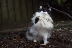
This is a photograph of my Cat, Martha. I chose to take a image of her as she is another reminder of home. We took her in a few years ago as she was a stray and she’s never left us since.  I think she has a beautiful black and white fur coat which I found really nice to capture and then edit through adjusting the exposure, levels and shadowing. Her white coat contrasts well against the black reflecting her fluffy fur and making her the main focus in the photograph. This was a action shot and quite hard to capture as she moves very fast so therefore I had to adjust the shutter speed. She is a reminder of home as she is not only just a pet but part of the family. From looking at existing animal photographers I tried to get inspiration and look at the lighting and framing techniques as animals I found can be tricky to photograph.  I believe out of all the shots I took of her this came out as the best one as her facial expression is present and it is clear that she is playing with the stick, resembling the play like behaviour of a cat.


martha


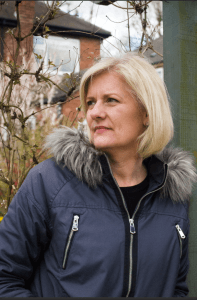
This is a photograph of my mother as she is a very big part of my life and reminder of home. For this image I got her to pose how she felt comfortable and I edited the image in concepts of levels, contrast, exposure and shadowing as it was quite a dull day and the natural light was pretty grey. To give more colour and glow to her face I enhanced the exposure, making it a lot more pronounced, making her look a lot more fresh faced. I like how her facial expression is clear and you can see her frowning as the light is in her eyes. Mothers are always a key concept of ‘home’ as they are the ones to look after you and always be there for you so she is key to this brief. I wanted to communicate with my audience the presence of how she is valuable and personal to me, I think I could of done that better.

Screen Shot 2016-04-11 at 03.42.18


Home Brief- image 1 & 2


This is a portrait of my Dad which I took whilst going home in the Easter holidays. I took it outside in our garden to get natural lighting. I got him to act natural and pose how ever he felt comfortable. I took many shots of him whilst he was stood there and after refining through them all I decided that this was the most engaging one. Even though he isn’t looking directly into the camera you can still receive the expression off his face. My Dad is a very calm and caring man and I feel like this is portrayed through his eyes in this photograph. I like the way the lighting has hit his face, causing his skin to glow and his eyes to have a reflection. The depth of field is shallow which is what I like in portraiture as the main focus is the person within the photograph, not the background.

My only criticism about the image is that a is a little grainy, it could be clearer but this is my first proper attempt at photography and I have learned a lot so far.

dad


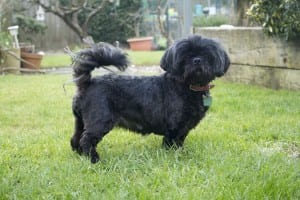
My second image is of my Dog Poppy as she is a big reminder of my home life.  I have had her for now 11 years so she has been around for more than half my life. This was a hard image to get of her as even though she is old she still acts like a puppy. I took this image in outside lighting as I find the lighting is more prominent and effective to the lens and the naked eye. I had to pretend to throw the ball for her to get her in this position. As you can see her tail is wagging and she is ready to run for the ball. Her eyes this way are also intently focusing on the ball, which i placed behind the camera so therefore I could get a clearer shot of her face. I took the photo at a landscape shot to match the positioning of her body.


poppy

Home Brief Research

For my home brief I am going to take images of my Mum, Dad, Cat, Dog and the Humber bridge as all these remind me of home. Due to me enjoy portraiture I decided to expand my skills which i had learnt and use it for 4 of my images. For the other I am going to be doing some landscape photography.


Peter Watson

I began by researching into landscape photography and looking at various artists. One that stuck out for me was landscape photographer Peter Watson.

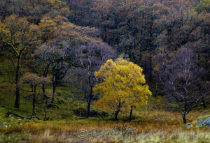
Watson taught himself photography and has been photographing landscapes since the early seventies. He is usually based in England but he travels extensively throughout Britain, America, Europe and Australasia. Taking images all over the world, captivating moments in beautiful locations just through the lens of his camera. He has been considered to be one of the greatest landscape photographers of his generation due to his style being so gifted and admired by many.

Here are some examples of his work which stood out for me

Screen Shot 2016-04-11 at 01.03.45 Screen Shot 2016-04-11 at 01.12.25 Screen Shot 2016-04-11 at 01.12.44 Screen Shot 2016-04-11 at 01.13.05

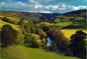
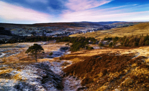
The way he captures the different colours and how they all dwell into one another is inspiring. Each image has a sense of being there in the moment, making you feel there at the destination. You are not just looking at the photo but you are there where it was taken. He has a good idea for capturing beautiful scenery and enhancing the colours creating a dreamy like feel.


http://http://www.peterwatson-photographer.com/