Still Life Research

1bg fruit still image apple Still life-flower-Rose-orange-10-Shutterbox photography Stamford- photographer Lyndsay Ford still tumblr_n2qxmlsW5w1r36ryso1_1280

These images are the most visually pleasing to me through the elements of colour and dark shadowing. The bright burst of colours really recite and emphasise the different flavourings of the fruit . Furthermore I like the positioning and structure of the object, for example how they have balanced the sliced fruit on top of one another. Producing the element of balance and the significance of each object. The light reflection of the image also gives it a shallow after glow, making it quite peaceful and endearing to look at. Each image is so crisp and sharp which I need to be able to reflect when photographing my objects. I am going to make sure the lens is fully focused on the object and the back drop is going to be blacked out as I find still life images to be a lot more appealing when there is nothing else distracting the object.

I really like these images I have found and unfortunately I do not know the artist who took them but their work has inspired me in my final designs for the Still life brief.

Appropriation Designs

I’m quite passionate on animal cruelty and certain stereotypes within society so I wanted to play with that. For example, I began my first appropriation design by conflicting the traditional stereotype of women. This was just a quick mock up but I wanted to display how women in society are portrayed as weak and home bound. They are supposed to stay at home cleaning and looking after the children while men go to work and earn the money. Therefore, I took an image of a women with cleaning products in her hands and swapped them with iconic male aspects (Bottle of beer and a bag of money).

appropriation 1


I then began to think deeper and wanted to try and portray a more influential and creative meaning. I got the idea of using a bar code on a zebra as they both work together very well with the message I’m trying to perceive. The Zebra is an endangered species which is killed in mass for its coat and organs for human consumption. By swapping its stripes for a barcode this communicates how the animal is a product to the human eye. I then added a clothing tag to the zebra with text saying ‘I am no Product’. The photo of the zebra is staring directly into the camera which creates a powerful engagement with the viewer. Furthermore, depth of field is sustained in the image as the zebra is the main focus in the image.  I liked this design I created as its quite simple but very effective.

appropriation zebra


For this design I took an image of a 1960’s nuclear family, all sat round watching television. Media from the beginning has been infiltrating ideologies into society through media consumption, e.g. this image. The hyperdermic needle theory suggests how a message that is portrayed is directly received and accepted by the receiver. Supporting that everything the media produces and communicates, people believe. The expression ‘Brainwash’ is how I would describe this process. Therefore, I layered identical images of washing machines on top of the families’ heads. I believe this message is pretty simple and is easy to understand what I am trying to communicate.

approproation brain washed


I have a strong view on animal cruelty and animal testing is one process which I don’t agree on. I looked at what beauty cosmetics test on animals and L’oreal Paris is a large global company which is consumed by a mass of people. The slogan for their product is ‘Because you’re worth it’ and I wanted to question that. Is cruelty and testing on animals worth the beauty products we utilize? I chose this image as the layout of how the rabbits are positioned is very effective. They are all in a line looking at the camera, engaging the viewer and the fact they are restrained creates more of a powerful impact. I believe that people who consume these products ignore the reality and this design shows realism.

appropriation animal testing


This design relates to how there isn’t much difference between factory workers and non free range chickens. The conditions and environment looks very similar so I went with a ‘spot the difference’ approach. Its very self explanatory and creates a powerful statement on how humans in this day and age are treat like animals. I looked at existing examples of spot the difference design typography to create a more realistic image.

spot the difference


Appropriation Research

To begin my research, I began by looking at various appropriation examples. I wanted to portray in my designs depth within the image, by creating a deeper meaning. I used the search engine ‘Google’ to get a clear understanding of the brief and a outline definition of the word ‘Appropriation’, enabling myself to carry out the assignment efficiently.

‘Appropriation is the intentional borrowing, copying, and alteration of preexisting images and objects.’ (Moma.org, 2016)  I found that appropriation uses largely recognisable existing images which the audience already has a understanding of and alters the recognisable ideology into another meaning.

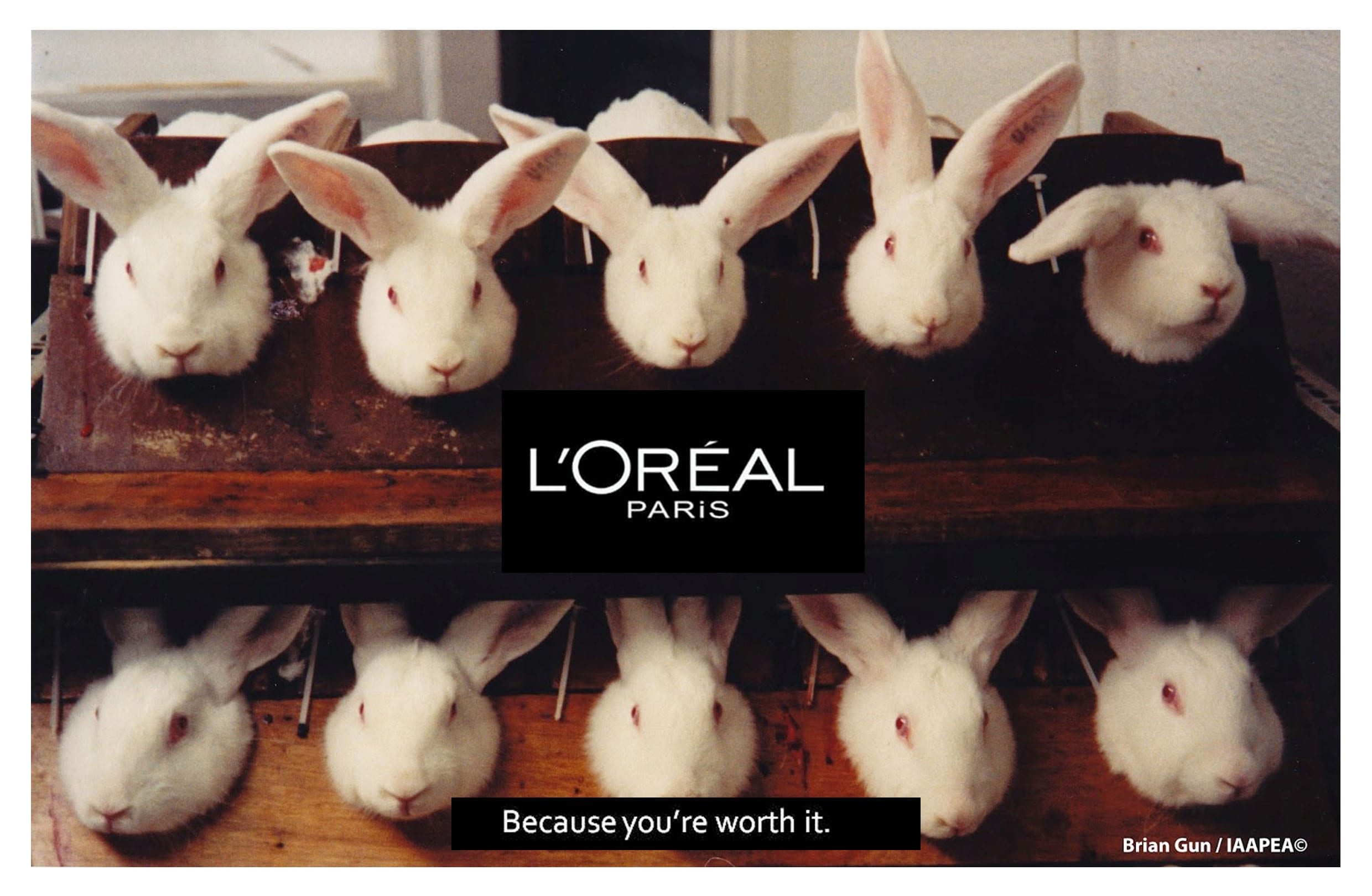
Here are some examples of appropriation images I gathered during my research;


Richard Prince interpreted the famous photograph, Yes, Rasta by Patrick Cariou. This appropriation design caused huge controversy leading Prince to be taken to caught under copy right claims. Overall Prince walked free as the Supreme Court denied Cariou’s petition and the case settled in 2014. (Richardprince.com, 2016)

Left-Patrick-Cariou-Yes-Rasta-2000-Right-Richard-Prince-Graduation-2008


Barbara Kruger.

I found Kruger’s interpretation of Kim Kardashian quite humorous and also accurate. The fact that Kim tries to portray herself as a selfless icon when really all she cares about is herself and her image. Kruger has taken an originally, sexual photoshoot of Kim K, and turned it into a humorous innuendo towards the celebrity. (Barbarakruger.com, 2016)

kim k approp


Banksy

Banksy interpreted the original art piece ‘Bridge over a pool of water lilies’ by Claude monet 1899.  I like what he has done here as he has shown a more reality reflection on it.  He’s taken a peaceful scenery and disrupted it with a discarded trolly and a traffic cone. It contradicts the meaning behind the original image, crating a very powerful and famous appropriation design. (Banksy.co.uk, 2016)

appropriation


The picture below of President Obama was taken by  photographer Mannie Garcia. The image has no meaning behind it as its just a photo of him thinking at a presidential campaign . After then being uploaded to the media it was interpreted into a stencil design and titled ‘HOPE’. This created a promotion of Baracks leadership and him brining hope to the country.

barrack ob


Bibliography

Banksy.co.uk. (2016). Banksy. Available at: http://banksy.co.uk/ [Accessed 14 Apr. 2016].

Barbarakruger.com. (2016). Home – Barbara Kruger – Photograph Collage, Advertising, Slogans, Art. Available at: http://www.barbarakruger.com/ [Accessed 14 Apr. 2016].

Moma.org. (2016). MoMA | Appropriation. Available at: https://www.moma.org/learn/moma_learning/themes/pop-art/appropriation [Accessed 14 Apr. 2016].

Richardprince.com. (2016). Richard Prince. Available at: http://www.richardprince.com/ [Accessed 14 Apr. 2016].


BRIEF 1 – APPROPRIATION

kim k approp

Task – Liberating media images that already exists within the public domain and recontextualizing, with new readings and intentions. 

The brief specifies that I look at advertising images and intervene in some way to subvert the original meaning.