I’m quite passionate on animal cruelty and certain stereotypes within society so I wanted to play with that. For example, I began my first appropriation design by conflicting the traditional stereotype of women. This was just a quick mock up but I wanted to display how women in society are portrayed as weak and home bound. They are supposed to stay at home cleaning and looking after the children while men go to work and earn the money. Therefore, I took an image of a women with cleaning products in her hands and swapped them with iconic male aspects (Bottle of beer and a bag of money).
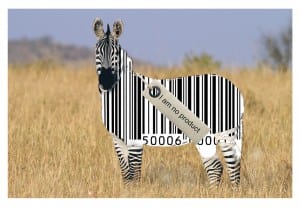
I then began to think deeper and wanted to try and portray a more influential and creative meaning. I got the idea of using a bar code on a zebra as they both work together very well with the message I’m trying to perceive. The Zebra is an endangered species which is killed in mass for its coat and organs for human consumption. By swapping its stripes for a barcode this communicates how the animal is a product to the human eye. I then added a clothing tag to the zebra with text saying ‘I am no Product’. The photo of the zebra is staring directly into the camera which creates a powerful engagement with the viewer. Furthermore, depth of field is sustained in the image as the zebra is the main focus in the image. I liked this design I created as its quite simple but very effective.
For this design I took an image of a 1960’s nuclear family, all sat round watching television. Media from the beginning has been infiltrating ideologies into society through media consumption, e.g. this image. The hyperdermic needle theory suggests how a message that is portrayed is directly received and accepted by the receiver. Supporting that everything the media produces and communicates, people believe. The expression ‘Brainwash’ is how I would describe this process. Therefore, I layered identical images of washing machines on top of the families’ heads. I believe this message is pretty simple and is easy to understand what I am trying to communicate.
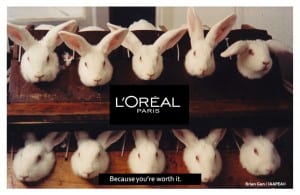
I have a strong view on animal cruelty and animal testing is one process which I don’t agree on. I looked at what beauty cosmetics test on animals and L’oreal Paris is a large global company which is consumed by a mass of people. The slogan for their product is ‘Because you’re worth it’ and I wanted to question that. Is cruelty and testing on animals worth the beauty products we utilize? I chose this image as the layout of how the rabbits are positioned is very effective. They are all in a line looking at the camera, engaging the viewer and the fact they are restrained creates more of a powerful impact. I believe that people who consume these products ignore the reality and this design shows realism.
This design relates to how there isn’t much difference between factory workers and non free range chickens. The conditions and environment looks very similar so I went with a ‘spot the difference’ approach. Its very self explanatory and creates a powerful statement on how humans in this day and age are treat like animals. I looked at existing examples of spot the difference design typography to create a more realistic image.


